Thursday, 16 October 2014

Thematic project ideas

Hi guys! Today I am talking about my thematic project.


I needed to think of ideas so below is an online mind-map I created on Prezi.


Full mind-map


Friday, 10 October 2014

My movie poster

Hi guys! This blog is showing my own movie poster.  This is part of the proximity project we got set this week.


My own movie poster

I designed this movie poster on Photoshop.  I have used my own screen-shots from my AS Film Studies short film project.  I made this film in November 2013, it is about a girl (Anchisa/Un) who at the start of the film is being chased by this mystery person (who we later find out is Alice). The reason why Un is running away from Alice is revealed during the film...Un overhears ALice talking to her friend (me) something, she only hears "don't tell anyone okay".  However, Alice finds Un overhearing and we go back to present day and in revenge Alice shoots Un.
(Alice doesn't really shoot Un...haha)

Proximity is shown in this poster by including a lot of screenshots and a lot of text.  I feel that the screenshots are presented very differently which makes the poster look unique.  I decided to make the title of the film (Interpretation) bigger than the other text included in the poster because this will make it stand out a lot and also it contrasts with the other text in the poster.

Examples of proximity

Hi guys! Today I am going to talk about proximity and I am going to use examples to help me explain it.


Proximity means "when faced with random objects on a page, the viewer will often try to find connections. Designers can aid viewers by arranging objects (text and/or images) into groups in order to convey meaning and help disseminate their message.  This closeness of these groups is proximity"


Example 1


Example 2 (business card)


Thursday, 9 October 2014

Movies with proximity

Hi guys! Today I am going to talk about some movie posters that have proximity included in movie posters.


Movie poster 1


This movie poster includes a lot of proximity.  For example, you can see on the left side of the frame, 'Taken' is taking up most of the left side.  Also, in the centre there is a lot of empty space which is where proximity isn't used a lot. 

This poster was made in 2008.


Example 2

This poster is advertising the movie, Jaws.  I feel that this movie poster is very full so this means that it includes very little of proximity.
This is because the poster is including a lot of information - for example, you see who stars in the film, director, information about the film (terrifying motion picture...), and the picture of Jaws swimming upwards to the human.


This poster was made/produced in 1975 by Roger Kastel .


Movie poster 3


Lastly, this poster is the same as the Taken poster- it includes a lot of proximity. This is becuase Hilary Duff (Lizzie) is taking up most of the right frame, also the title of the film is quite long.


 This Lizzie McGuire movie poster was made in 2003


Sunday, 5 October 2014

My Design 2

Hey guys! Below is my business card design 2...


This business card design was also made on Photoshop.  
 
I really like this business card idea because I really like the use of different fonts and colours.  This makes it more eye-catching and also I like that each font is easy to read and the colours are bright enough to see. 
 
I changed this business card around because I thought I would add colour to the background to.  This is because I think that this business card also is very abstract because each information point is at a different angle which makes it look very interesting.  Each information point it at a slight angle, each angle is at an angle you can read clearly which is good.
 
Updated version of design 2


I think that my first design (previous blog entry) is a lot better and I would use that as my business card to advertise my photography work!

Saturday, 4 October 2014

My design 1

Hey guys! Today I am going to talk about my first business card design...


Design 1


I created this on Photoshop. 

I decided to use different colours for different information because it makes it look very funky but unusual at the same time.  The colours I chose were black, pink, purple, green, blue and red.  This is because all these colours are very bright and they all contrast with the white background.  This makes the business card very eye-catching and different.   On this business card I have also used different fonts for each information point.  I decided to change the font for each point because it makes each point stand out, and also it makes it really colourful.


Better business card...


I talked to my teacher and he suggested that I shouldn't change the font AND the colour for each information point.  Instead I should change the font of each point and just keep the font the same, but then keep the colour change for each point as it is very colourful and eye-catching.  So below this paragraph is the updated and improved version of my business card design 1..

Improved version of design 1

Friday, 3 October 2014

Buisness cards

 For the following images, I got these from Goggle. 
 
 1


I really like this business card because I think it is creative and I also really like the idea that the logo is 3-D.  This is very different because it makes this business card very creative and also you can tell that the business card is a property estate (house) 
 
2

 
This business card I think it s very clever and creative idea.  However, I feel that they haven't got enough information on the business card itself. This is because at the front of the card it just says the company's name and then on the back it just says something very unusual and not funny.
 
 
3
 
 
This business card is okay. I like the idea that he has covered his
eyes  with the card itself but I feel that you can't really see the card which
means you don't know what the company is advertising.
 
4

 
This is my favourite already used business card because I think it is very original and you
know exactly what they are advertising (a photographer).  I think the bright colours are a factor because they are very eye-catching.  I also think that the use of text on the lens shape is really clever, also the use of different colour for the writing is a clever idea so the 2 colours wont contrast.
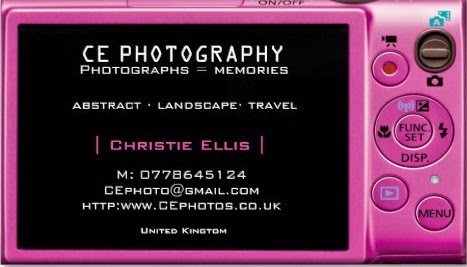
 
 5

 
I LOVE THIS BUISNESS CARD!!! I think it is
really creative and very clever way of advertising cargo.  I think it is very unique
but the only problem with this is when you turn the card into a box you might
forget you placed it into a box and then you might brake the card itself. 

Thursday, 2 October 2014

buisness card idea (photography based)

Hi guys! This blog today is going to be some designs I created using Zazzle (link below). Zazzle is an online retailer that allows the public to customise their own merchandise.

http://www.zazzle.co.uk/compact_digital_camera_photography_business_cards-240856781756702896


Logo design for Zazzle


Design 1


Front of buisness card
Back of buisness card

 I really like this buisness card  design because I think it is really clever design as the front of the buisness card is the front of a camera.  The lens on this buisness card is 3-D which is really cool so this makes it 'in your face' and very eye-catching.    However, I don't think the black camera makes the buisness card very 'unique'.  This is because black is quite a boring colour so it doesn't make it very eye-catching.

Design 2

Front


Back
 
This buisness card design is more eye-catching and brighter as the other design, This is the same idea as the other design but different back and also different colour.  Pink is my favourite colour so this makes it very personal and eye-catching.    The layout on the back is very unusual but creative at the same time because there are 2 differnet colours which go with black (this makes the writing really clear), and also like how there are different different fonts and size.