Friday, 3 October 2014

Buisness cards

 For the following images, I got these from Goggle. 
 
 1


I really like this business card because I think it is creative and I also really like the idea that the logo is 3-D.  This is very different because it makes this business card very creative and also you can tell that the business card is a property estate (house) 
 
2

 
This business card I think it s very clever and creative idea.  However, I feel that they haven't got enough information on the business card itself. This is because at the front of the card it just says the company's name and then on the back it just says something very unusual and not funny.
 
 
3
 
 
This business card is okay. I like the idea that he has covered his
eyes  with the card itself but I feel that you can't really see the card which
means you don't know what the company is advertising.
 
4

 
This is my favourite already used business card because I think it is very original and you
know exactly what they are advertising (a photographer).  I think the bright colours are a factor because they are very eye-catching.  I also think that the use of text on the lens shape is really clever, also the use of different colour for the writing is a clever idea so the 2 colours wont contrast.
 
 5

 
I LOVE THIS BUISNESS CARD!!! I think it is
really creative and very clever way of advertising cargo.  I think it is very unique
but the only problem with this is when you turn the card into a box you might
forget you placed it into a box and then you might brake the card itself. 

Thursday, 2 October 2014

buisness card idea (photography based)

Hi guys! This blog today is going to be some designs I created using Zazzle (link below). Zazzle is an online retailer that allows the public to customise their own merchandise.

http://www.zazzle.co.uk/compact_digital_camera_photography_business_cards-240856781756702896


Logo design for Zazzle


Design 1


Front of buisness card
Back of buisness card

 I really like this buisness card  design because I think it is really clever design as the front of the buisness card is the front of a camera.  The lens on this buisness card is 3-D which is really cool so this makes it 'in your face' and very eye-catching.    However, I don't think the black camera makes the buisness card very 'unique'.  This is because black is quite a boring colour so it doesn't make it very eye-catching.

Design 2

Front


Back
 
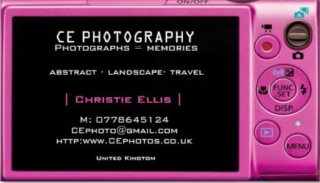
This buisness card design is more eye-catching and brighter as the other design, This is the same idea as the other design but different back and also different colour.  Pink is my favourite colour so this makes it very personal and eye-catching.    The layout on the back is very unusual but creative at the same time because there are 2 differnet colours which go with black (this makes the writing really clear), and also like how there are different different fonts and size.

Monday, 29 September 2014

Homework part 1

Hey! Today I am going to talk about my homework part 1.  I decided to do a poster because it is easy to make and also I thought it would be a good idea to have a poster which shows lots of text and little images on it.


First half of poster

Other half of poster

Full size poster

Homework part 2

Part 2 of my homework.  I decided I would do a front page of a website, a website advertising my photography work. 


Template before I changed it


I didn't want to keep the template the same because otherwise that would be copying, and also it would be more personal and also I designed it so I created it by myself. The original doesn't have an interesting background

My version of the website...(after)


I decided I wanted to give my front page for the website some colour/funk as I was thinking of advertising my photography work.   The bright colours make it look very eye-catching and very bright.  I really like the background because I think it is really colourful and also it works well with the other colours on the page.

Thursday, 25 September 2014

Examples of fonts

Hi guys! This blog entry today is about good and bad fonts.  I have uploaded different types of fonts and below them I have explained what I like about the particular font.  Enjoy reading :)


Good fonts


Example 1


This font is really interesting because I like how every letter/number has a curly in it. This font will make the logo more eye-catching, however it might be too curly and some of the letters don't need a curly added to it. 
Example 2
This font is very plain and boring,  I wouldn't personally use this font for my logo but I put it in the good fonts category because it is very clear and easier to read.


Example 3


I really like this font because it is very funky and it is a 'disco-like' theme. This makes the font stand out more and also it causes the font to have a ‘funky-feel’ towards it.  I am thinking of using this font and maybe adding colour in each circle to give it a young look towards it.

Bad fonts


Example 1
This font is very un-clear and I feel that each letters has too much lines on them. For example, the letter 'O' normally has no lines on it but then this font makes the 'O' has lines - I feel this is very unusual. Also, I feel that this font is not right for my logo because I want the font to be very clear and eye-catching, so this makes the members of public look at my logo.

Example 2


This font isn't very good.  I think this because they are very hard to 
and also I feel that personally this type of font won't work for my logo.  This is because my logo design is targeted at members of the public who are interested in Photography, or others that are just researching artists for their art work.   


Monday, 22 September 2014

Contrast - reseach (excisting logos)

Hi guys! Today I am going to talk about some logos that have either good or bad contrast.  Bad contrast will include poor lighting, dark colours and boring font.  Good contrast includes bright colours, good lighting and funky font.


Good contrast


2012 Olympic Games logo


This logo is an example of good contrast.  This is because it includes bright colours for example, bright pink fills the numbers and then bright yellow outlines the numbers.
 I also really like the font in this logo because  it is very funky and different.  For my logo design I have used a lot of colour because it catches the publics attention.


Apple logo


This logo to the left is Apple's old logo before they changed it to all white.  I think that this logo is much better than the current logo because this one is very colourful which makes it stand out a lot.

This logo is similar to my CRE logo because I added colour to my logo to make it more colourful and eye-catching.

Bad contrast

FedEx logo


This logo has a a poor example of contrast.  This is because the font is exactly the same which makes it look very boring, and also the colours (purple and orange) aren't the brightest colours I've seen in logos.

EOS logo


I think that this logo has bad contrast because even though the font is very different (I like how the O is presented) but overall the font in this logo is okay.  I think it is quite plain I feel that the logo could be more exciting.